What it is
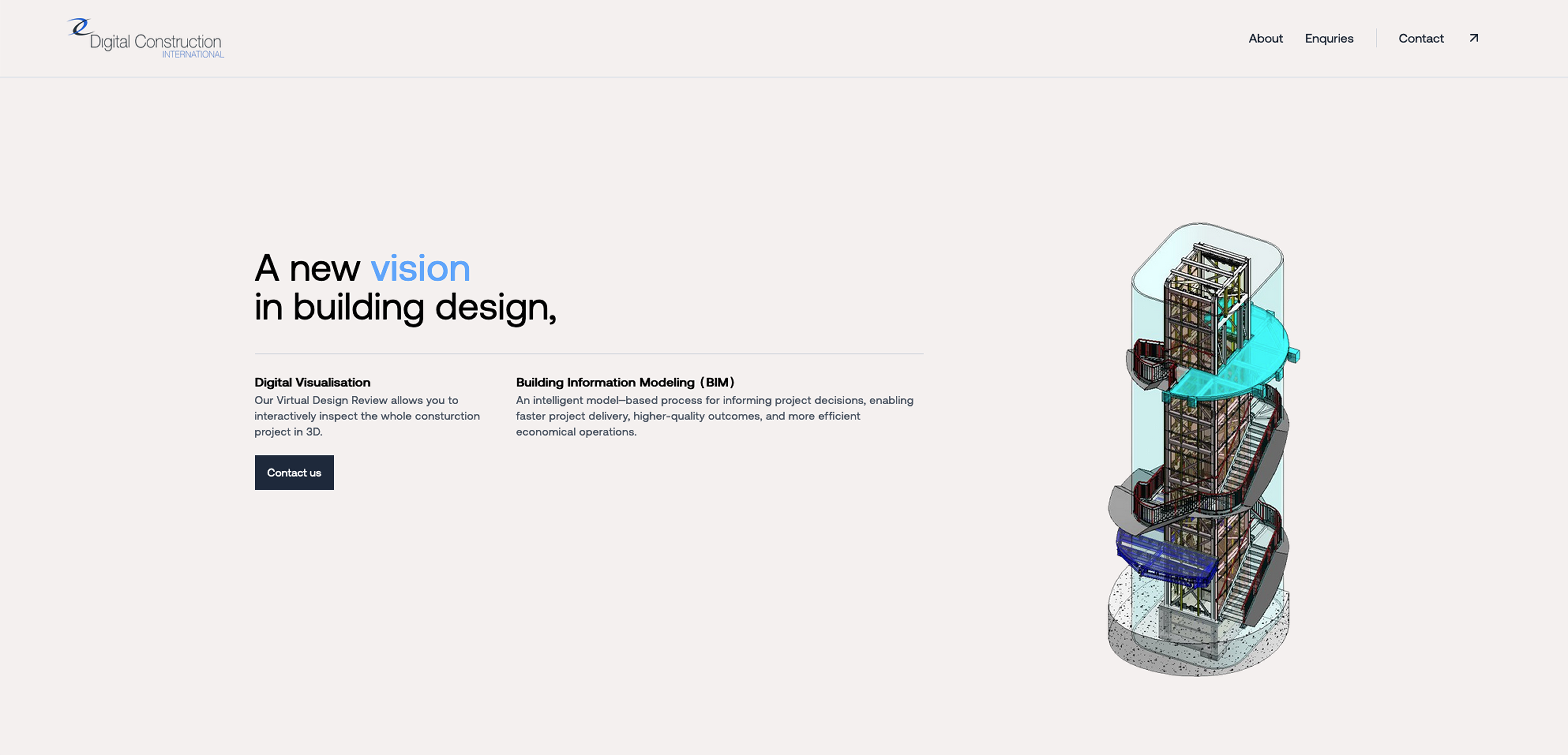
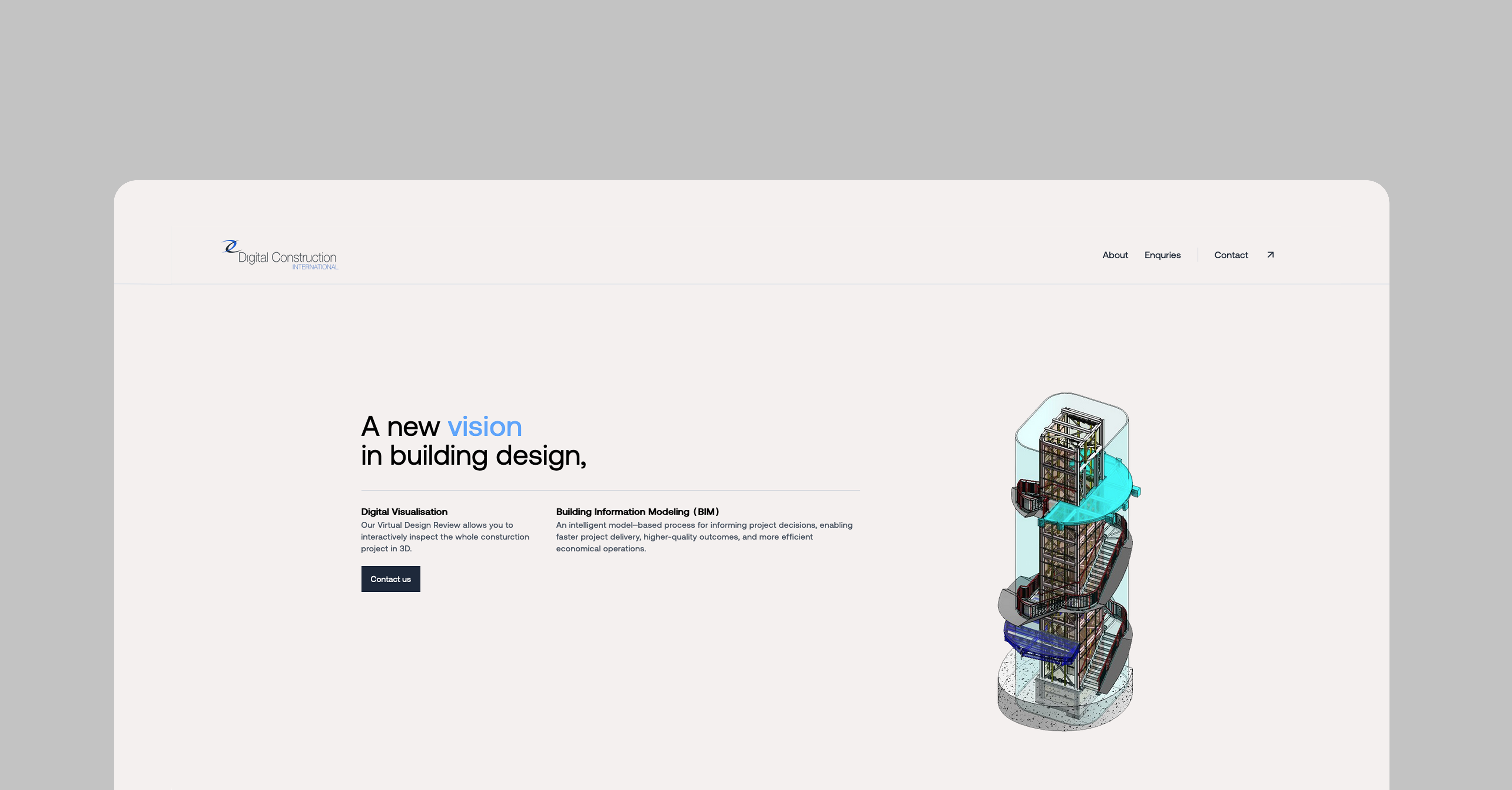
Digital Construction is a website redesign for a structural engineering firm. The old site had useful information, but it was buried under a dated layout, slow pages, and a mobile experience that did not match how clients actually browse. The goal was not to make something flashy. The goal was to make the firm feel precise, current, and easy to trust.
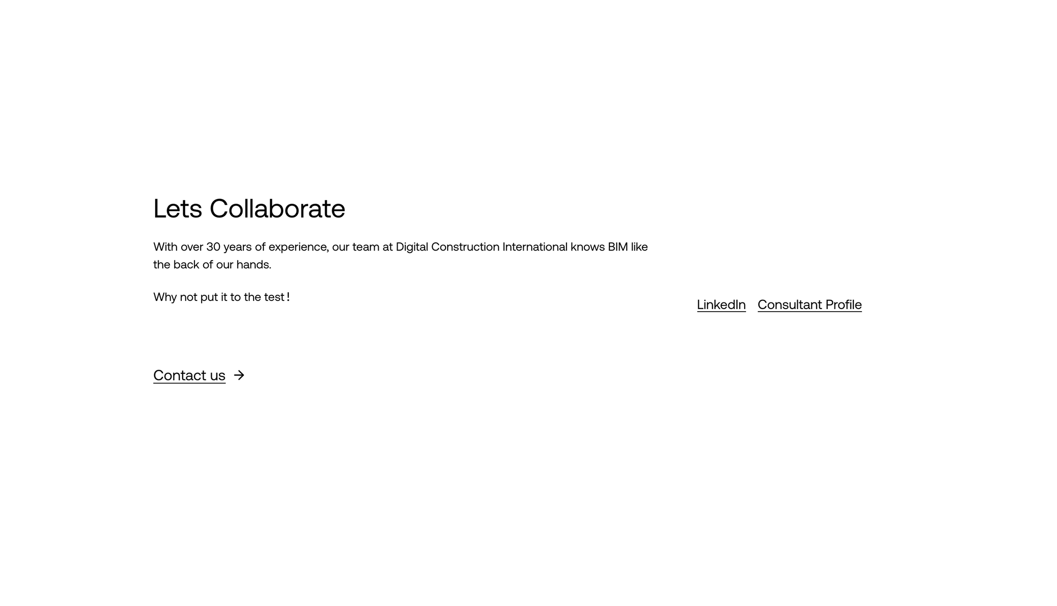
For this kind of business, the website is usually the first credibility check. A visitor wants to know what the firm does, whether it has handled similar work, and how to start a conversation. The redesign puts those answers closer to the surface.
What changed
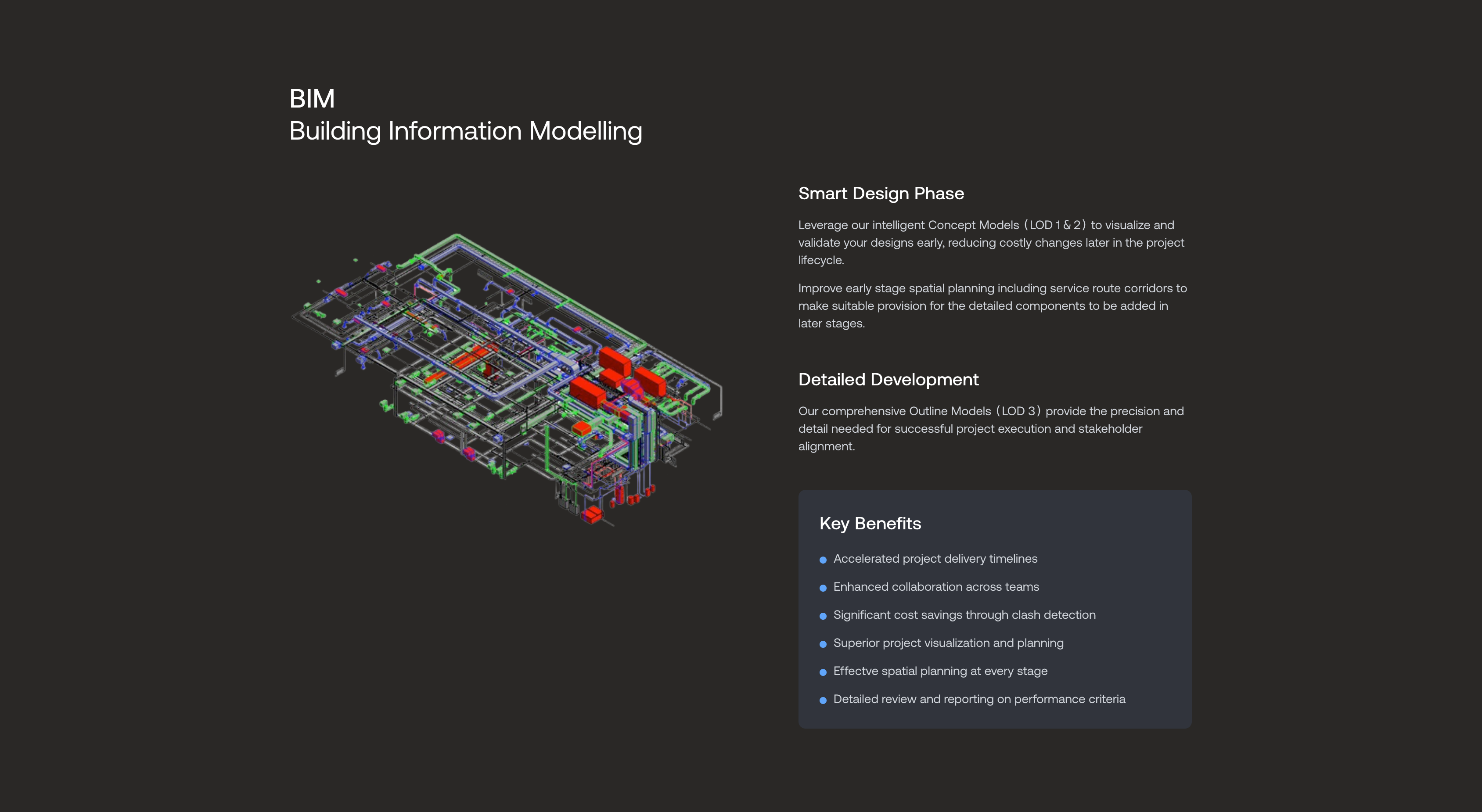
The new structure gives the site a clearer path: services, project examples, team expertise, and contact routes. Project work became the main evidence. Instead of hiding examples in a loose gallery, the redesigned pages use stronger imagery, short case notes, and enough detail to make the engineering capability understandable without turning the page into a technical report.
The visual system is restrained on purpose. Structural engineering does not need a loud brand treatment. It needs a layout that feels measured, readable, and reliable. Most of the design work was spacing, hierarchy, and deciding what not to show.
Technical build
Stack
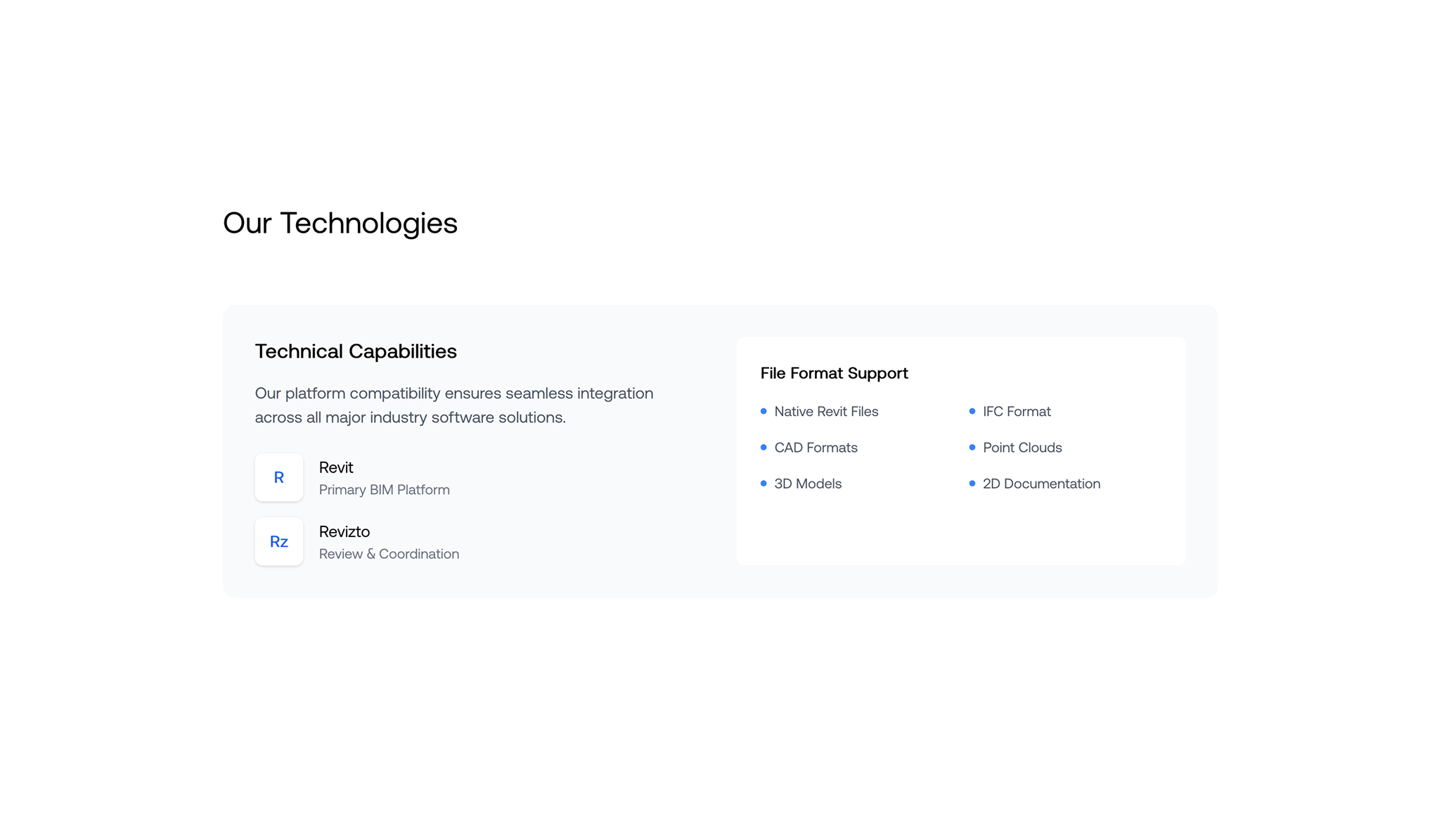
The site was built with Next.js, TypeScript, Tailwind, Framer Motion, and Vercel. Next.js was a good fit because the content is mostly static, the pages need to be fast, and the business benefits from clean metadata and predictable routing. Tailwind made it easy to keep spacing and typography consistent across service pages, project pages, and contact sections.
Implementation details
The page structure is component driven: service blocks, project previews, team cards, and calls to action are all reusable pieces. That keeps the site easy to extend without creating one-off layouts for every new page. Images are lazy loaded where possible, and the heaviest visual sections are kept away from the first render path.
The contact flow is intentionally simple. Instead of one generic form doing everything, inquiry types help route a message based on the kind of project a visitor is asking about. The technical work is not complicated, but it matters because every extra bit of friction can cost a lead.
Result
The finished site is faster, clearer, and much easier to use on mobile. It gives the firm a stronger first impression and makes its project work easier to understand. It is a straightforward commercial website, but that is exactly why the details matter: trust is built through small, consistent decisions.