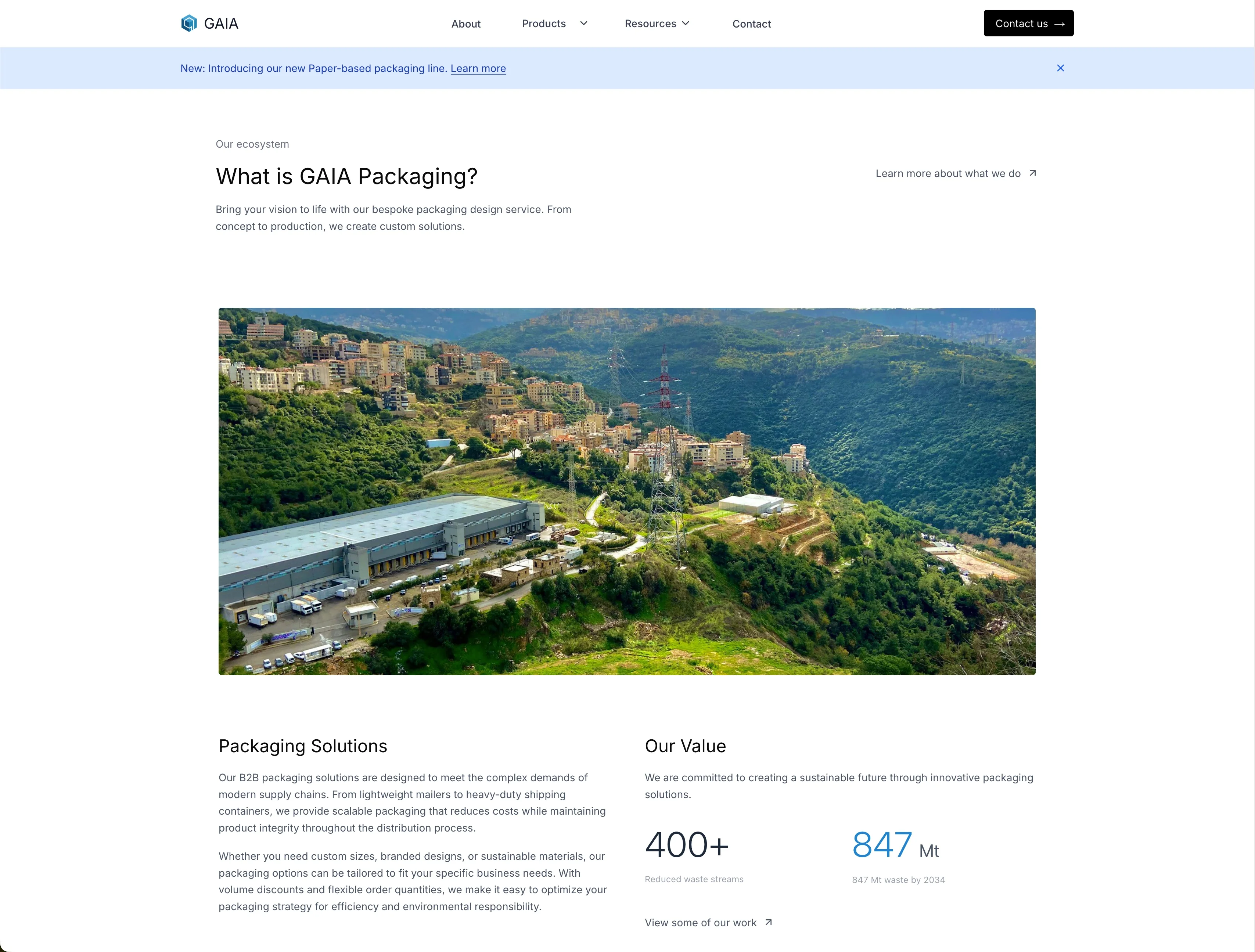
A packaging buyer is not browsing for fun
They usually arrive with a box size, a fragile thing, a shipping volume, and a deadline that was more comfortable last week. They need to know which material will work, which machine produces it, whether the combination suits their line, and who to ask when the answer is “it depends.”
Gaia’s old site made that conversation harder than it needed to be. The company had a serious range of packaging systems, but the web experience flattened it into a brochure. Products were difficult to compare, useful documents lived in odd corners, and keeping a specification current meant remembering everywhere it had been copied.
The redesign became less about making pages and more about explaining a business: a clearer identity at the front, a proper product hierarchy underneath, and a content system capable of keeping the two in agreement.
The catalogue has to explain a family tree
Packaging products rarely arrive alone. A product line can contain several machines; a machine can support different materials, variants, and applications; the same brochure may belong to more than one useful route through the site. Treating every item as an isolated card would have produced a very tidy mess.
The new structure moves from solutions to product lines and then into individual products. A buyer can understand the family first, compare the available variants, and only then open the machine that fits. Breadcrumbs preserve the route back, while related products provide a sensible next step without turning the page into a recommendations carousel.
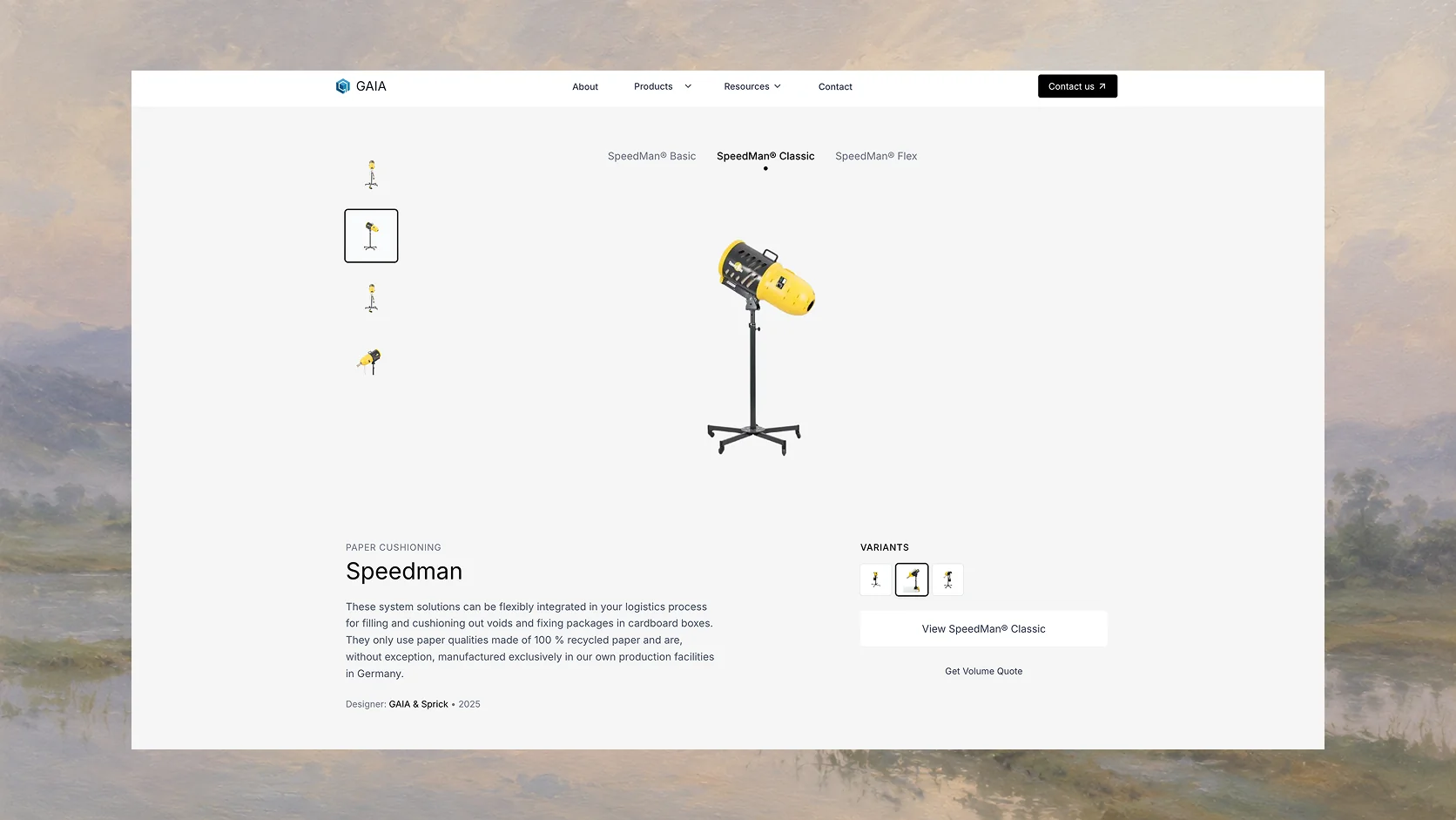 Product-line page
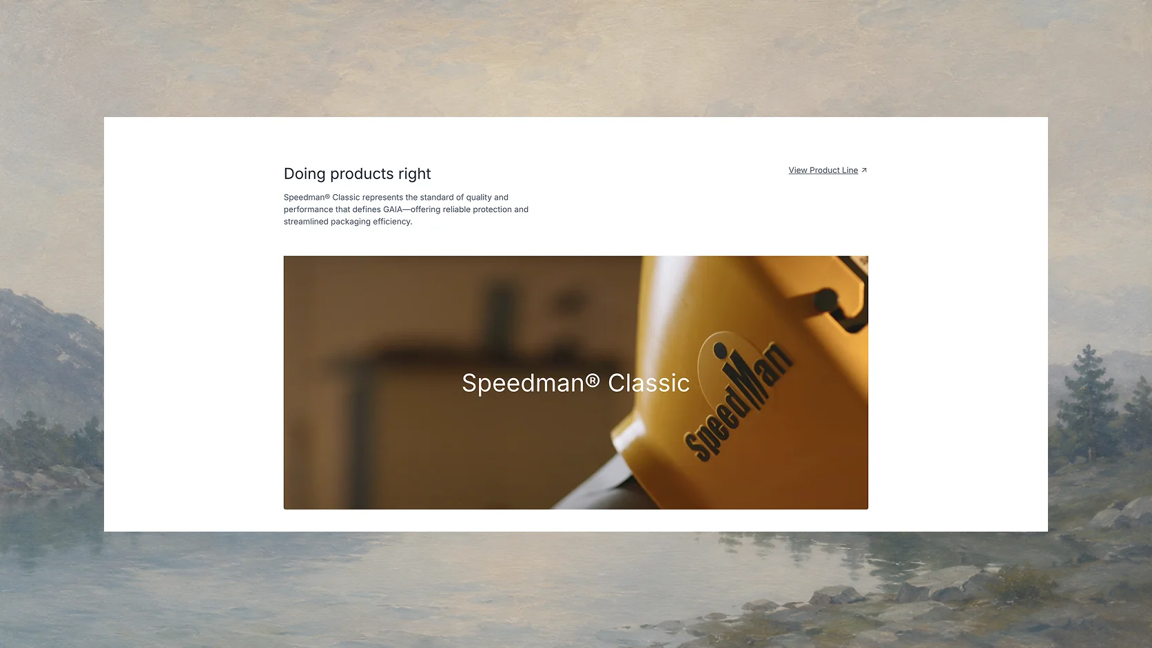 Product line system
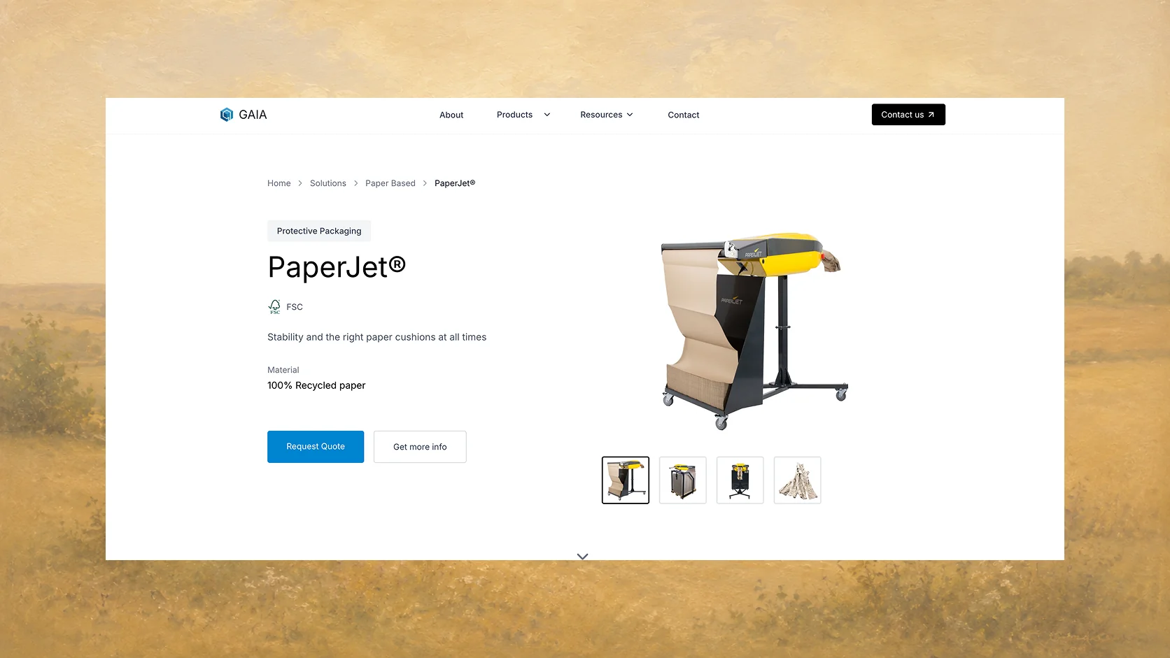 Product page
A product page should finish the first sales conversation
The top of each page answers the fast questions: what the product is, what it is made from, what certification applies, and whether the visitor can request a quote. Further down, the page can take its time with demonstrations, applications, features, specifications, downloads, and related equipment.
That order matters. Procurement does not need a cinematic introduction before learning that a machine is the wrong size. An engineer does not want a vague “contact us” button where a specification table should be. The page starts broad enough to orient someone and becomes more exact as they move down it.
Downloads are part of the product record rather than a separate filing cabinet. Brochures, technical sheets, manuals, and installation guides can still be explored through the resource library, but the relevant documents also appear beside the machine they describe. Content is allowed to live in more than one place without being authored more than once.
The cms is the quiet machinery
Payload holds the site as connected records rather than a collection of finished pages. Product families, individual machines, materials, certifications, resources, applications, case studies, and editorial pages each have their own shape. Relationships join them together.
Add a brochure to a product and it can appear on the product page and in the filtered resource library. Update a material description and every product using that material receives the same language. Mark a product as new and the homepage can surface it without somebody rebuilding a promotional section by hand.
The page builder is deliberately bounded. Editors can assemble approved content blocks, choose imagery, arrange calls to action, and publish announcements, but they do not need to recreate spacing, typography, or mobile behaviour with every update. Freedom is useful; a different design system on every page is not.
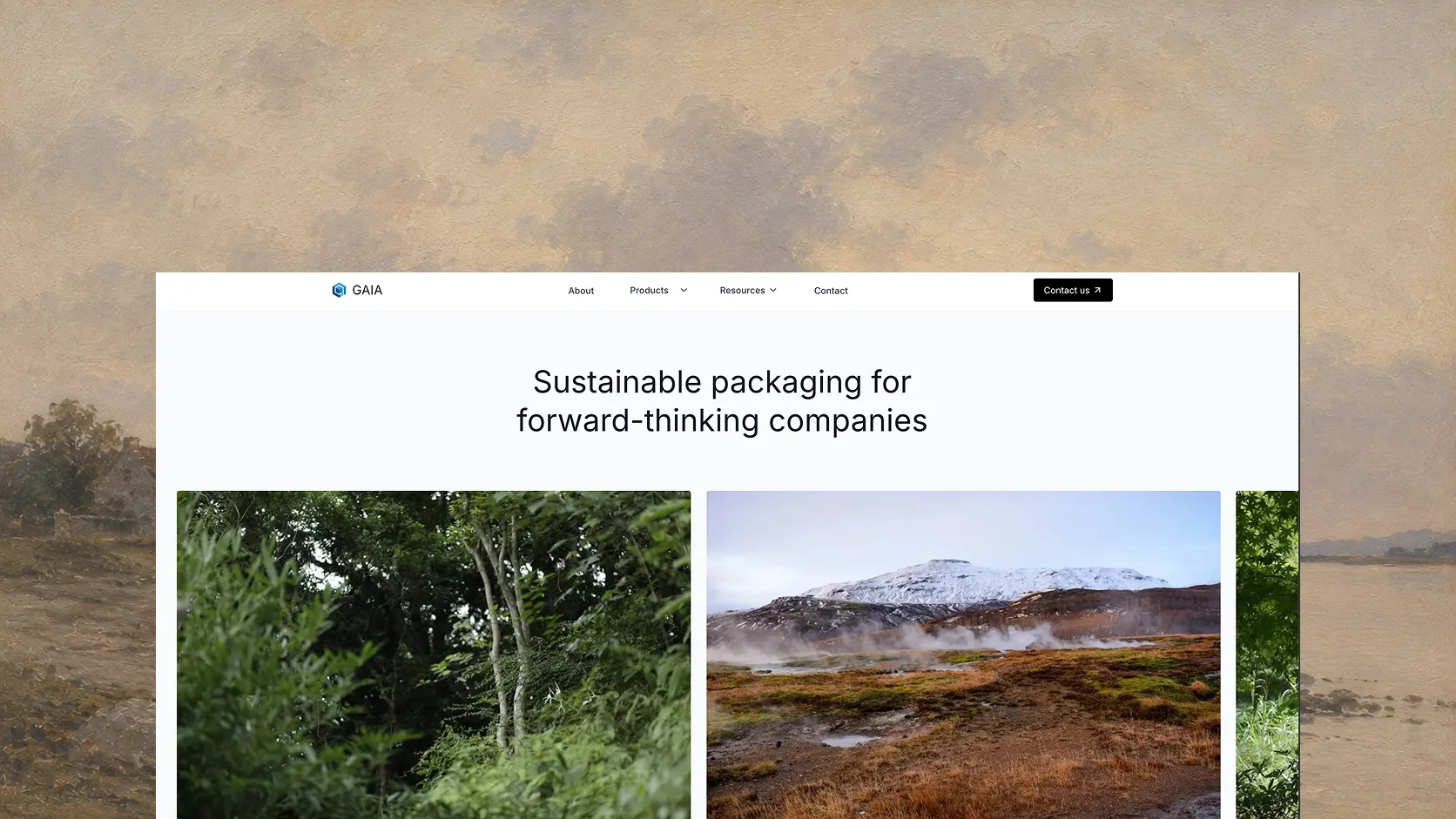 Sustainability landing page
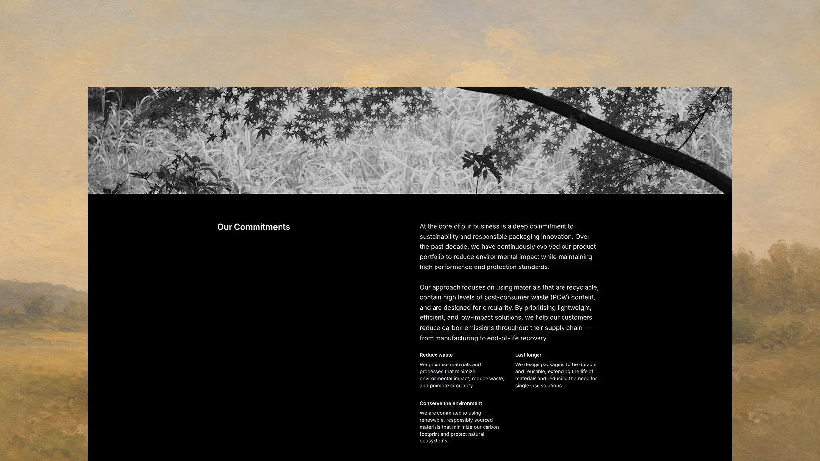 Commitment
Sustainability has to survive a second question
“Sustainable packaging” can become wallpaper remarkably quickly. The site therefore gives claims somewhere to go. Material choices, recycled content, certifications, product documents, commitments, and case studies are separated into things a visitor can inspect rather than compressed into one green sentence.
The visual identity follows the same rule. Blue remains recognisable to Gaia, while large white spaces, restrained typography, product photography, and landscape imagery make the company feel assured without borrowing the usual pile of leaves. Sustainability is treated as product information and business practice, not a decorative mood.
The site remembers why somebody got in touch
A quote request from a PaperJet page is different from a general enquiry. The contact flow carries the product and route with it, so Gaia receives the context the visitor already supplied by browsing. Resend turns the submission into a consistent internal notification and customer acknowledgement instead of a mystery message titled “website form.”
Next.js serves the public site, while Payload owns the editorial data behind it. Typed contracts keep product records predictable between the content system and the interface; Vercel and Cloudflare handle delivery and caching. None of that should be visible to a buyer. What they should notice is that pages load quickly, information agrees with itself, and an enquiry reaches the right conversation.
A site the business can keep using
The finished product is not one impressive homepage. It is a set of routes that make sense together: product families for orientation, detailed pages for evaluation, resources for due diligence, editorial pages for trust, and enquiries that retain intent.
Just as importantly, Gaia’s team can add the next machine, brochure, certification, or announcement without calling a developer to rearrange the furniture. The site looks more confident because the company is represented more clearly—but it stays useful because the machinery behind it is deliberately boring.